Set The Mood With Valspar's 2023 Paint Colors Of The Year
I'm feeling blue. They call me mellow yellow. I'm green with envy. These are all examples of times we use colors to describe our moods, but when it comes to letting color influence our mood, the design world is playing catch-up with color theory.
"It's a part of our core, but for many years color has been excluded from our homes," interior designer Elaine Ryan told HGTV. She's seen a growing trend in people wanting rooms to be painted in colors they "respond to and that make [them] feel good." This trend only grew through COVID-19 and even in the face of a shrinking economy, studies still found a growth in the amount of money people are spending on renovating their homes.
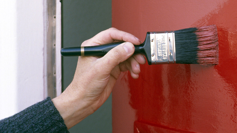
Companies that fall under the home improvement umbrella, from paint brands to makers of bed sheets, have a lot of competition. In order to help set themselves apart from other brands on the market, what Architectural Digest calls "legacy paint brands" have joined the likes of Pantone and started releasing their own Color of the Year to stake claim "in an ocean of competing hues."
But with preference and style being so individualistic, some companies have opted to pick a full palette of colors instead of just one hue. Valspar, part of The Sherwin-Williams Company, partnered with Pantone in 2013 to release a line of paint with mood in mind. Recently, the company unveiled what 2023's biggest home decorating colors will be.
Valspar's 2023 colors of the year draw inspiration from being 'close to home'
Valspar color marketing manager Sue Kim explained to The Spruce that they took inspiration from things that are "close to home" when choosing their 2023 colors of the year. It's why she said they continued to pull from local cultures and wanted to bring nods to the past into the future.
Valspar drew from Japandi style, for example, when choosing neutral shades Cozy White and Villa Gray, per The Spruce. They also included Holmes Cream, which The Spruce describes as feeling warm and comforting. For a slightly darker take on neutrals, Real Simple highlights Southern Road as a paint color that will inspire contentment. Described as a "muted shade of clay with brown undertones," it can help you "feel more grounded." The Spruce adds that Valspar's Ivory Brown and Desert Carnation are other great earth-tones that can help inspire creativity and focus.
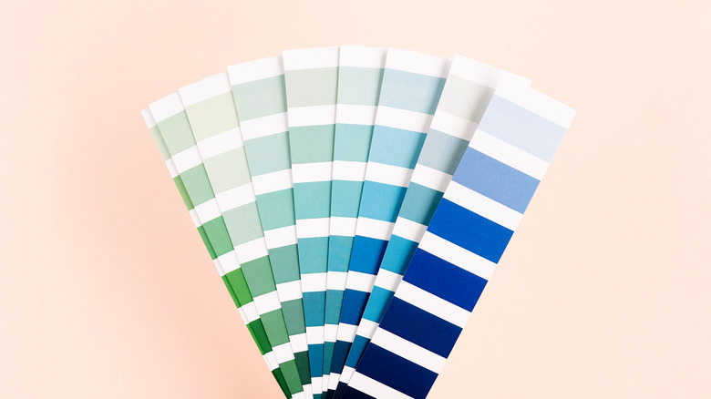
Green Trellis, a green that Real Simple describes as a "fresh take on sage green," is meant to evoke calm, while Rising Tide is an equally calming soft blue version, which can add the feeling of playful sophistication to any space, per The Spruce. Gentle Violet is a lavender alternative to these calming colors. Flora and Blue Arrow, meanwhile, offer up equally calming and inspiring takes on the same shades. If you dig the blues and greens but want to go bolder, Everglade Deck — what Real Simple calls a "rich midnight blue" — is the color for your home office.
A color of the year is meant to inspire not direct
If you've seen "The Devil Wears Prada," you know Miranda Priestly tells Andy Sachs the reason she's wearing a cerulean blue sweater is that the people in that room decided cerulean would be popular. Here's the thing: She wasn't wrong.
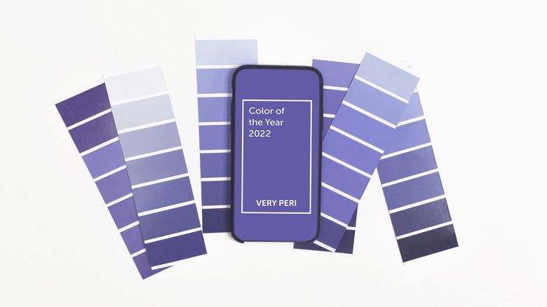
Pantone did reveal its first "color of the year" in 2000, sending a blue wave through the fashion world, per Architectural Digest. However, cerulean — the color of the year in 2000 — and the COTY since aren't picked at random; for companies like Pantone, the choice is actually workshopped between themselves and other members of CMG, a non-profit that "helps pick and predict colors for a variety of products," per the Los Angeles Times. Members must make their cases for why they believe their choice fits into the design zeitgeist.
The conversation is more two-way than you'd expect. A former CMG member, told the Los Angeles Times that the whole point of picking a color of the year is to help point people in a direction, not to dictate what their lives look like. Andrea Magno, Benjamin Moore's director of color marketing and development, told Architectural Digest that they actually track trending colors and draw their inspiration for their COTY from there. "Our goal," she explained, "is to inspire new ideas around color and possibly bring a new color idea to the mind of someone embarking on a painting project."
Yes, paint color can affect your mood
Valspar's 2023 paint color picks do have their foundation in psychology. Dr. Mary Gregerson, the President of the American Psychology Association's Society for Environment, Population, and Conservation Psychology told Architectural Digest: "Color affects you totally, with both your mind and your body responding together to the outside stimulus."
There are generalizations about different colors based on anecdotal evidence. Blue, for instance, is thought to be very calming. According to Country Living, blue is also supposed to help lower your blood pressure, slow your breathing, and "calm your mind," making it an ideal bedroom color. One study published in the Frontiers of Psychology shows that blue walls were actually preferred and were felt to "facilitate studying activity" when used in a college dorm room setting. Pink, Country Living, is also said to be very calming the more you spend time in it.
However, before you rush to repaint your room one of Valspar's colors of the year, you're going to want to consider how a color makes you feel. "Each person responds uniquely to different colors," Gregerson explained to Architectural Digest. "Individual differences need to be considered, first, and foremost, when considering how paint colors affect people." Setting and lighting, Gregerson adds, also have a major factor in how a color is felt. For instance, in her experience green feels "less positive" than neutrals in urban settings, the ties to the environment too stark a contrast to city life.