The Truth About Color Theory
A quick browse on Pinterest can leave even the most ambitious amateur decorator feeling overwhelmed and out of their depth. But, if all the time at home recently has left you unsatisfied with your basic bland walls and IKEA furniture, the good news is just a few tweaks can have it feeling like a totally new space in no time. The key? Color!
There's a reason fast food joints tend to be decorated in reds and yellows while spas are more typically decked out in cooler-toned neutrals: color can directly impact our emotions (via LifeHacker). With a little basic information on color theory, you can turn even your least favorite rooms into a personal sanctuary, so here's what you need to know.
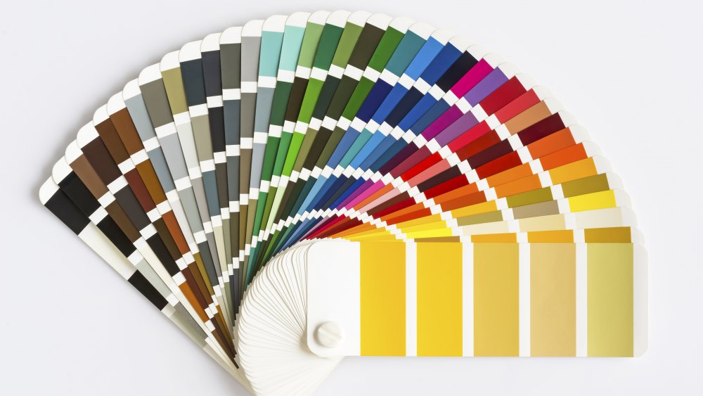
The first step is to take a look at the color wheel (the same one you probably saw in elementary school). It's made up of different types of colors: primary (red, blue, and yellow), secondary (green, orange, and purple) and tertiary (yellow-orange, red-orange, red-purple, blue-purple, blue-green, and yellow-green). A little more information and you'll be mixing and matching these shades like a pro (via Cosmopolitan).
How to use color theory to pick the perfect paint
A good place to start with decorating a room is to think about the mood you want to be dominant in that space. Try taking a picture of a place you feel particularly good, or at ease, and looking closely at the shades and colors present there (via The Wall Street Journal). In general, cooler colors, like purple, green, and blue have a calming and soothing effect on our mood, while warmer colors like orange, red, and yellow are energizing and can actually make you feel hungrier (via Business Insider). When in doubt, start with neutrals or pastels, which create a calming effect that can also increase mental focus.
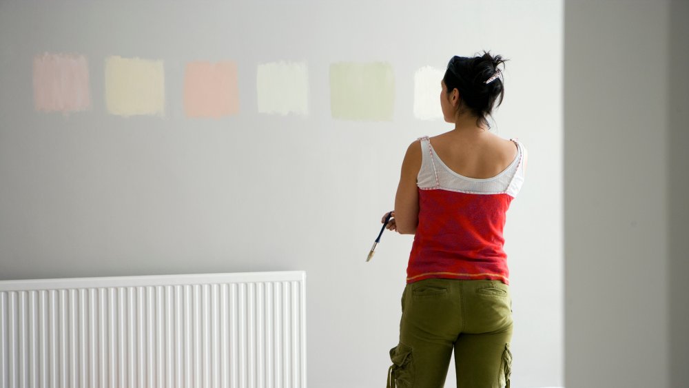
However, before you go out and buy a few gallons of the trendy new paint color you've seen all over Instagram, think about how all of the walls in your home should generally go together and flow from one room to the next (via Patch). To prevent post-paint remorse, get a few different paint samples and leave them up for a week or so you can see the way they look in different lighting conditions (bright daylight, artificial light, etc.). This will give you a sense of how the colors really impact your space and your mood. Also, don't be afraid of going for white; it can help create feelings of light and spaciousness, and is unlikely to clash with the style of decor you choose.
How color theory can reinvent your space
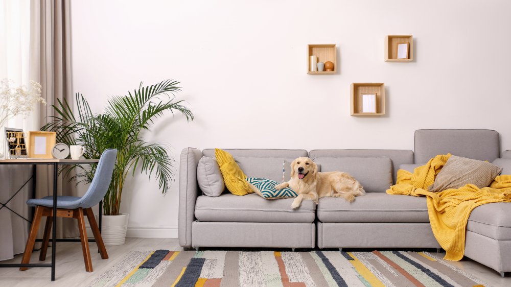
Once you have your wall color picked out, you've essentially created the frame of your space. Now it's time to decorate the canvas. A good place to start is with the larger items of furniture. As a general rule, cooler colors made for better backgrounds, while warmer colors tend to jump out, making for better accents. For example, a cool-toned neutral couch acts as a great backdrop for a bright pink, orange, or red throw pillow. Keeping the brighter shades in your decor as accent pieces also gives you more freedom to redecorate when you feel like a change, without having to spend time or money repainting walls or re-covering furniture.
If you're nervous about picking colors that clash, the simplest way to start is to choose larger articles of furniture in white, black, and neutral colors. From there, you can choose any accent color you want and it's sure to compliment the neutral backdrop. If you're more adventurous, the colors opposite each other on the color wheel will provide the most impact (think orange and blue, purple and yellow, and red and green) (via Complex).