Carmeon Hamilton Shares Design Mistakes To Avoid

Carmeon Hamilton is one of the hottest interior designers on the block right about now. She took home the big win on the reboot of HGTV's mega-popular "Design Star." The reboot — aptly titled "Design Star: Next Gen" — aired on Discovery+ and introduced viewers to her "modern bohemian" style. According to House Beautiful, she emerged as a fan favorite during the competition and managed to rise above the rest of the talented designers to secure the winning title. Part of her prize was a Discovery+ show of her own called "Reno My Rental."
Luckily, fans of Hamilton's chic aesthetic don't have to wait for a new episode to learn more from the Memphis-based designer. She also runs a blog that she keeps updated with handy articles. Several of them provide more in-depth glimpses into her time on both "Design Star: Next Gen" and "Reno My Rental." Others impart specific design advice on topics ranging from custom framing to the best planters on the market. A must-read on her blog finds Hamilton spilling some tea on common design mistakes that are easy to avoid while decorating your home. Don't worry, everyone makes mistakes — even the pros from time to time. Read on to find out if you're a repeat offender and learn how to correct the error of your ways!
Make sure your rugs are big enough
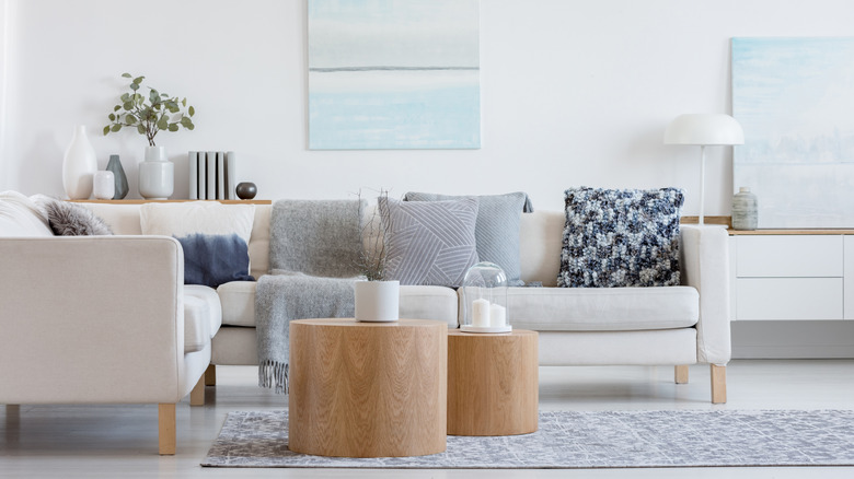
You may think you've transformed your home into a sanctuary. However, you'll always feel like something is off if you finish a space with an inappropriately sized rug. Carmeon Hamilton put it simply: "Your room needs a room-sized rug." According to the design pro, rugs should be at least a minimum size. For example, you'll want an 8x10 foot rug (or larger) for a living room, dining room, or bedroom.
Designer Emily Henderson shared a couple more tips for finding a living room rug on her blog, Style By Emily Henderson. She recommended picking one that is at least 6 inches wider than a sofa on both sides and suggested an ideal distance of 30 to 36 inches of space between large pieces of furniture. Also, consider where your furniture lands on the rug. Anything that's entirely on it shouldn't be too close to an edge, or it will look like it's about to fall off. It's a safe bet that at least two legs of a sofa should be on a rug. Henderson asserted that you could "float" a rug (meaning it doesn't sit underneath the legs of sofas and chairs, like in the picture above), but it is important to consider proportions. If the rug is too small, it will look like a postage stamp in the middle of a desert.
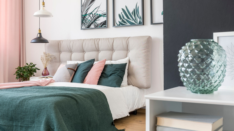
Curtains need to kiss your floors
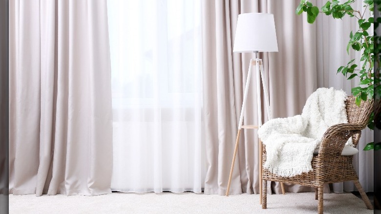
If you think there's nothing else to worry about once you select an appropriately sized rug, then it's time to think again. According to Hamilton's blog, another common design mistake to avoid is a trend she refers to as "high-water curtains." Never heard of them? Take a look at the drapes in your home. Do they stop about a foot above the floor? If so, you are officially living with high-water curtains. Don't worry, this is a totally treatable disease.
Hamilton recommended that your curtains "kiss" the floor, meaning that the hemline at least touches or comes very close to touching the ground. How much contact is up to you; a couple of inches of pooling will give a romantic effect, while less than 1/2 inch of distance between the floor and the hem will look more modern. The curtain rod should land halfway between the top of the window and the wall; you can even install it a little higher if you'd prefer. It's not just length that matters, either. Hamilton recommended choosing broad enough curtains to look still full when closed. A single panel curtain is about 45 inches wide as a rule of thumb. To determine how many panels you'll need, measure the window's width and add 12 inches on both sides. If that number is more than 45 inches, get at least two panels to provide adequate coverage (via The Spruce).
Furniture doesn't have to be pushed against the walls
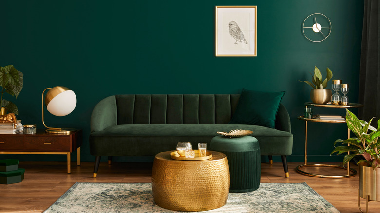
Look at the photo above. It's beautiful, huh? However, we'll let you in on a secret. The furniture placement works because it's a two-dimensional image. If you were actually inside a space where the majority of the furniture was placed against a wall, it would likely look and feel flat. Hamilton agrees. The third design mistake that she urged readers to avoid is the trap of putting every piece of furniture against a wall.
Why? For starters, think about all of the awkward spaces you create when everything is glued on one plane. Additionally, this sort of layout isn't very conducive to having conversations or watching TV in the living room. What should you do instead? Apartment Therapy recommended leaving a distance of 12 inches between the wall and the sofa to make a space feel more open. The publication also encouraged creating "zones" or mini rooms within a room. Each zone can serve a different purpose. For instance, in a living room, one area might be for conversing while another is closer to the television. A TV also provides a focal point in the space, which will help create a sense of hierarchy and purpose (via The Spruce). It is equally important to give every seat a table (for resting drinks on, if nothing else) and to leave enough room to move around without bumping furniture.
Hang your art where people can see it
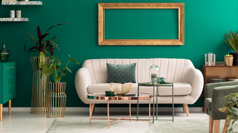
Like any other element of a well-designed room, art does not always come cheap. That means you'll want to really show off the paintings, photographs, and knick-knacks that take up real estate on your walls. That's hard to achieve if you hang items too high to be seen. According to Hamilton's blog post, artwork may be the star of a space, but it shouldn't be placed so high that people have to look up like they would to see a shooting star. Instead, the goal is to hang things at eye level. For a person of average height, that's 64 to 66 inches above the ground.
It's not just about how high a piece of art is hung, either. Make sure you consider the scale of the piece against the rest of the space. A single 8x10 inch photograph positioned behind a large sofa is going to look silly (via The Spruce). Instead, consider sizing the piece up with an ornate frame or creating a gallery wall using multiple selections. Of course, art is subjective. Architectural Digest reminded readers that any rule (even the one about how high to hang a painting) could be broken for whatever reason. After all, in this case, you'll be the artist of your own space. That means you get to make your own rules; think of these simply as recommendations.
Eclectic furniture is much more natural looking than buying all matching pieces
There's something to be said for putting together coordinated outfits. Someone with style knows how to step out in a look that is cohesive without coming across as overly matchy-matchy. That's what will land you on a best-dressed list. The furniture in your home is much the same. If you want to be the envy of all your friends, read closely because this common design error is a doozy. Hamilton warned readers away from selecting furniture for a room that is all of one matching set.
She shared on her blog that we're each individual with layers of history, personality, and interests, and our furniture should be just as multifaceted as we are. That means that you should shop around for pieces that speak to your style instead of simply walking into a store and buying a bedroom set that will make your room a total snooze fest. It's pretty, but it likely won't feel like you. Interior designer Darla DeMorrow shared a similar sentiment with Redbook. "Real homes are more organic than you typically see in a showroom. Instead of symmetry, seek balance," she explained. "Instead of matching candlesticks on each side of the mantle, create a layered art gallery or a flowing montage of seasonal accessories." Shopping may take more time, but the end result will be a room you cannot wait to be in.