The Home Decor Color Palette You Will Want To Embrace This Year
The truth is that when it comes to a dark color palette, there is often a love-hate relationship, according to Making Your Home Beautiful.
For a lot of people, even if a dark color palette seems appealing, it can also be exceedingly daunting. The concept of decorating part of your home using a dark color can be tough to get your head around, even if you like the stronger tones. It often feels far easier to opt for a neutral hue instead.
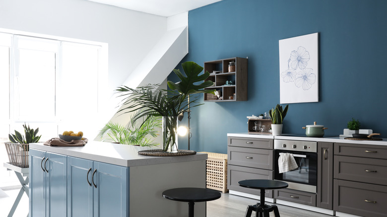
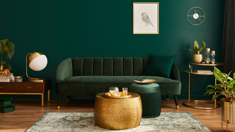
But when a dark color palette is used in the right way, it can "inject personality and style" into a room, per the outlet. Think: hague blue, bottle green, coal gray — these colors can create the most amazing spaces.
As per Good Housekeeping, interior designer Gail Davis says that "Dark is where it is at!," explaining that she recently used Benjamin Moore Century Darjeeling to decorate a guest bedroom and was thrilled with the end result, noting that the color scheme "takes your breath away."
Curious about making dark colors work in your house? Take a look below.
How to use a dark color palette in your home
According to The Spruce, people often assume that decorating in darker colors creates a depressing atmosphere, and that the dark colors make these spaces "feel small and claustrophobic." But Making Your Home Beautiful recommends taking into account the mood that you would like to create within the space. By determining what the space will be used for, you can work out whether a dark color palette will work well.
The Spruce explains that when a dark color palette is used properly, it can create a space that is warm, vibrant, and wonderfully cozy and welcoming.
Despite the common misconception that dark colors make small, dark rooms appear even smaller, that isn't necessarily the case. Because darker color palettes create a dramatic look, they can make a small space feel much larger. For larger spaces, dark color palettes can create a greater sense of warmth and coziness.
The Spruce recommends using dark shades that are "crisp, energizing darks." Using a combination of glossy finishes and matte finishes also tends to work well.
As for how to pair the rest of the room with the dark hues, the site notes to only use patterns "sparingly," and that "a mix of materials" (different fabrics or lighter colors) for the furniture and objects within the room "is essential."